Tufte nighmare #1
I've got too much work to do, but this graphic from today's Korea Herald purporting to show a precipitous decline in labor participation is so bad I couldn't help myself.
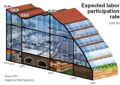
I mean, look a this beast. It violates everything Tufte ever advocated. First of all, the data-ink ratio is abysmally low. There are only 11 data points in this entire graphic. 11. Second, the image contributes nothing meaningful to the interpretation of the data. Third, the two-dimensional data is made three-dimensional, both distorting the data with interior escalators suggesting other data trends and disguising the trend line. This is made worse by the fact that the orthogonal perspective exaggerates the decline. Fourth, since the y-axis begins at about 55.5% and ends at about 61.5%, the 2.5 percentage point decline over twenty years is wildly exaggerated. The only redeeming aspect I see in the graphic is the attempt to use the building's windows to provide gridlines for comparing the data. This, of course, would not have been necessary if the pointless images was avoided from the beginning.
Folks, don't do this. It's bad, m'kay?
